
AI����L��ʸ���Pӛ����_Illustrator�D��Ԕ���̳�
���ߣ����� ��Դ����վ �r�g��2020-02-05 �c����118��
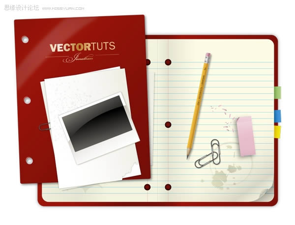
������K�D���A�[����������K���OӋ��Ʒ��Ҳ���҂�ҪŬ���_����Ч����
������һ��
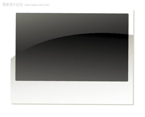
�������ÈA�Ǿ��ι��߮����Pӛ���Ļ���݆���D�Ρ��ɰ�ס���¼��^����׃߅�ǵĻ��ȡ�
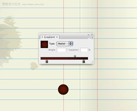
����Step 2
����ʹ�����D��ʾ���s��ɫ�ʝu׃��
����������
�������ƹPӛ��݆���D�ӣ���·���ϲ������г�һ�룬���D��

�������IJ� ������벿�֣�Ȼ��D����픡��O���^С�ĝu׃�Ⱥ�multiplyģʽ��100%���ȡ� ���岽 ��䓹P���߹�����߅�Π��Pathfinder�����г��D�Ρ� ������ ����������ɫ�u׃��ʹ֮����������һ�K�Ӱ�� ���߲� ��
�������IJ�
����������벿�֣�Ȼ��D����픡��O���^С�ĝu׃�Ⱥ�multiplyģʽ��100%���ȡ�
�������岽
������䓹P���߹�����߅�Π��Pathfinder�����г��D�Ρ�

����������
��������������ɫ�u׃��ʹ֮����������һ�K�Ӱ��

�������߲�
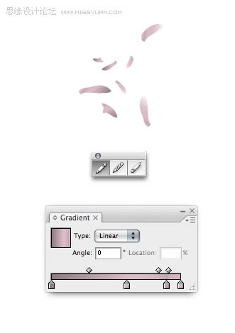
������һ����A��ɫ�ʵ�һЩ����������������߅���������Ч����ע�⣺ʹ�Ýu׃�r����߅ɫ�ʑ�ԓ����Щ���@�Ž�������⣬���ڌ��F���������ԣ��@���ǂ���Ҫ�ļ�����

������8��
�����o�����Pӛ������һ���Ӱ�������㣬�ܼӶ����Ӱȡ�Q�������X�ٶȡ��Ӱ������illustrator�ĈD����Ⱦ�ٶȡ����ǣ���������X���죬�@��ԓ���ǂ����}��

����Step 9 Create some colorful tabs by drawing a rectangle and then using the preset gradients to color them in. To access them go to Window Swatch Libraries Gradients Brights. You may want to make the
����Step 9
����Create some colorful tabs by drawing a rectangle and then using the preset gradients to color them in. To access them go to Window > Swatch Libraries > Gradients > Brights. You may want to make the highlighted color slightly darker as our design calls for the tab to appear as if it's wedged in between the pages.

����Step 10
����Create the ruled lines by first drawing two horizontal lines.

����Step 11
����Select both lines then go to Object > Blend > Blend Options. Select Specified Steps, enter a value then press OK. Go to Object > Blend > Make.

����Step 12
����This is the result. You can adjust the number of lines by going to Object > Blend > Blend Options.

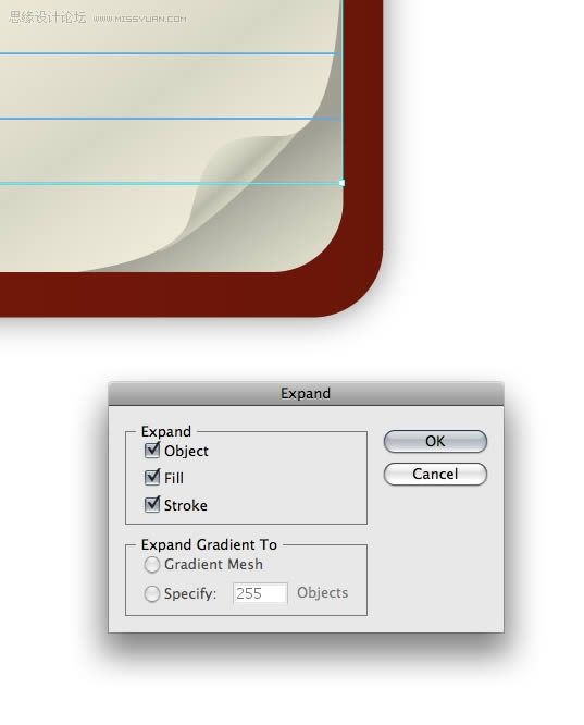
����Step 13
����As is, the lines overlap the page curl. To fix this, expand the blended lines by going to Object > Expand.
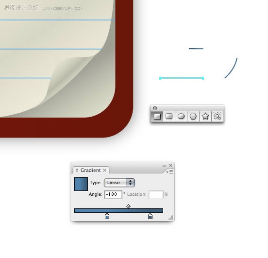
����Step 14 Ungroup the lines you just expanded and adjust their horizontal length. You cannot give strokes a gradient, so, using the Rectangle Tool (M) draw a very thin rectangle and give it a slightly
����Step 14
����Ungroup the lines you just expanded and adjust their horizontal length.
����You cannot give strokes a gradient, so, using the Rectangle Tool (M) draw a very thin rectangle and give it a slightly darker blue gradient. Draw a small curved line and give it a darker blue color too.
����Step 15
����Place your new elements on the page curl section.
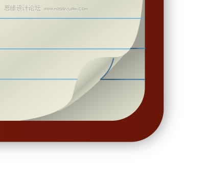
����Step 16
����This is what your design should look like right now.

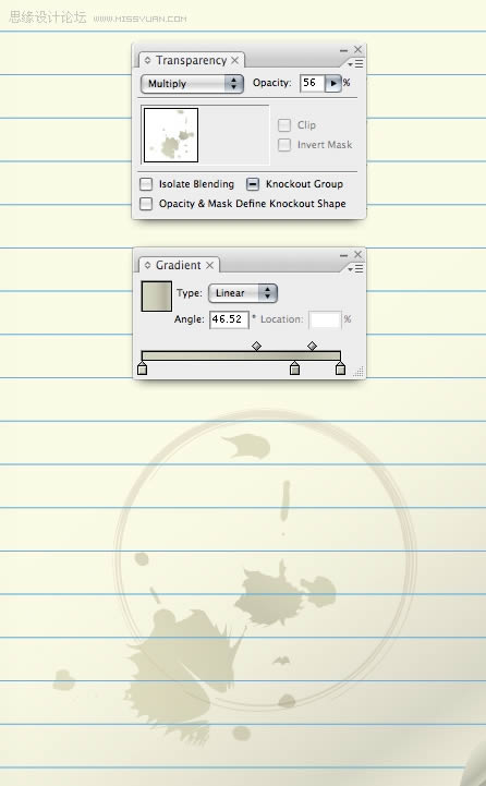
����Step 17
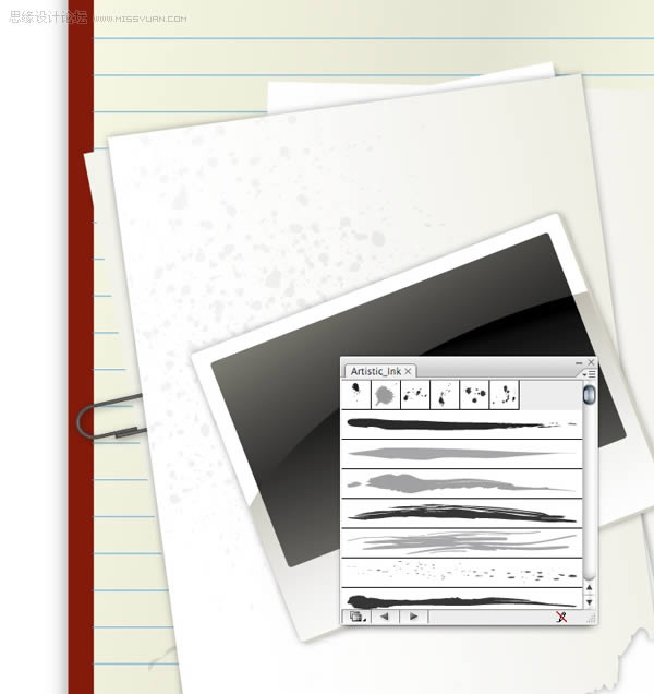
����Easily make random stains on the paper by using the Artistic Ink panel. Go to Brush Libraries > Artistic > Artistic Ink. You can drag the swatches right onto the page or you can draw a line using the Pen Tool and apply the swatch to the line. To further edit the ink swatches you'll need to expand the ink first.
����If you're familiar with Illustrator you may be able to recognize when someone is using built-in ink swatches. To remedy this simple alter the ink swatches by using the Crystallize Tool (found under the Warp Tool, Shift + R.) Or, try using a variety of warping tools to achieve some interesting results.

����Step 18
����Give your stains some gradients, set their Transparency to Multiply and adjust their Opacity to help them blend with the paper.
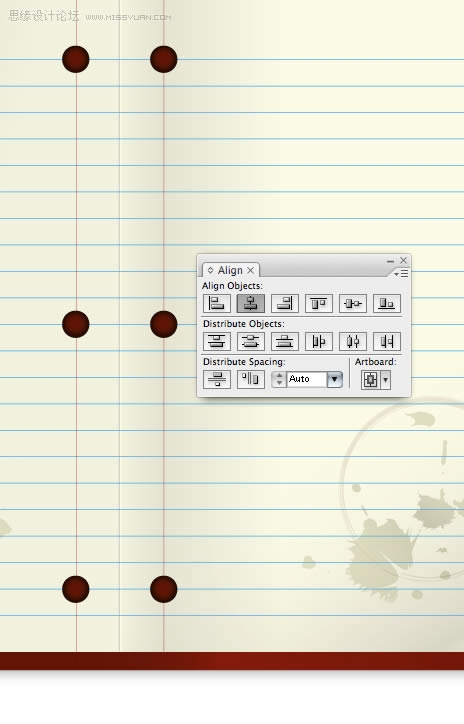
����Step 19 Create the holes in the paper by drawing an ellipse using the Ellipse Tool (L.) Step 20 Align your holes perfectly by using the Align Palette. Step 21 Construct the pencil using basic shapes.
����Step 19
����Create the holes in the paper by drawing an ellipse using the Ellipse Tool (L.)
����Step 20
����Align your holes perfectly by using the Align Palette.
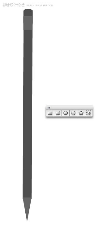
����Step 21
����Construct the pencil using basic shapes. Note, the triangle used for the tip of the pencil was created using the Star Tool. To vary the number of points the star has simply use the Up and Down Arrow keys while you're drawing the star shape.
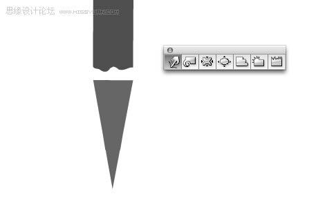
����Step 22
����Give the area shown below a jagged edge by using the Warp Tool.
����Step 23
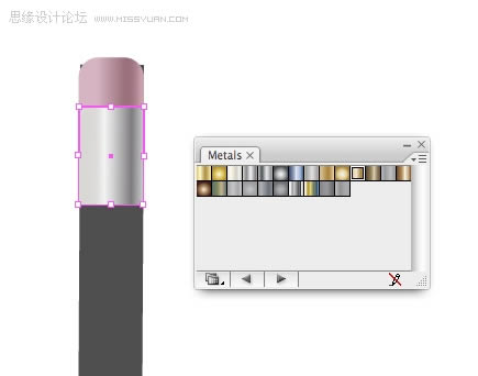
����Use Illustrator's built-in Metals gradients by going to Window > Swatch Libraries > Metals.
����Step 24
����The barrel of the pencil can be quickly created using a gradient to the fullest extent. To give the impression of a number of faces on the pencil apply a gradient with four colors, all slightly different but in the same family. Next, slide the yellow highlighted areas below so they're as close to the green highlighted areas.

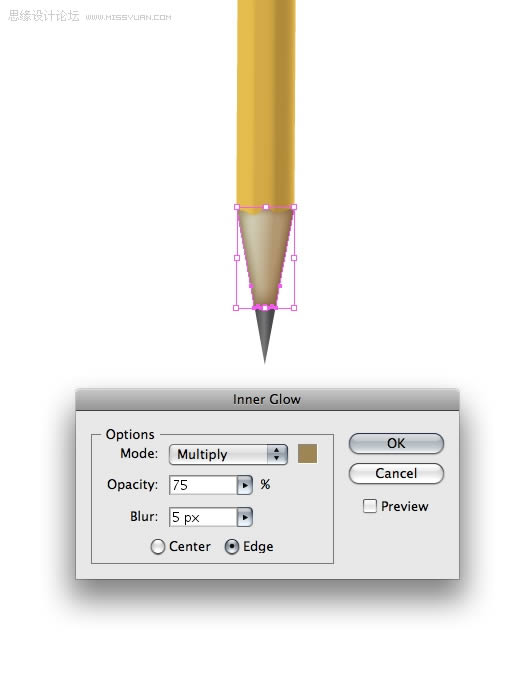
����Step 25 Give the tip of the pencil gradients. Give the exposed wood section of the pencil an Inner Glow by going to Effect Stylize Inner Glow... Step 26 Duplicate the metal part that holds the eraser
����Step 25
����Give the tip of the pencil gradients. Give the exposed wood section of the pencil an Inner Glow by going to Effect > Stylize > Inner Glow...
����Step 26
����Duplicate the metal part that holds the eraser on, condense it and alter the gradient to give the illusion of ridges on top of the metal base.

����Step 27
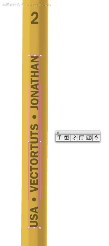
����Using the Type Tool (T) apply some text to your liking. The font I've used is ITC Franklin. This completes the pencil.
����Step 28
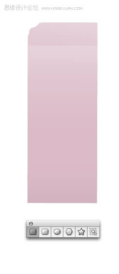
����To create the stand-alone pink eraser, draw a rectangle and give it a tenuous gradient. Take a notch out of the edge of the eraser by drawing a random shape and subtracting it from the rectangle using the Pathfinder.
����Step 29
����Create eraser shavings by using the Pencil Tool (N.) How convenient! Arbitrarily draw some shapes and apply a pink to grey-pink gradient. Note, the easiest way to close an open shape is to hold down the Option key when you are ready to close the shape.
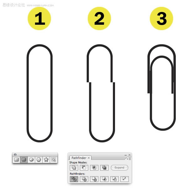
����Step 30 Create the paper clip by: Draw a rounded corner rectangle. Press the Up and Down Arrow keys to adjust the curvature of the rectangle. As you can see, the final shape is not a rectangle at all
����Step 30
����Create the paper clip by:
����Draw a rounded corner rectangle. Press the Up and Down Arrow keys to adjust the curvature of the rectangle. As you can see, the final shape is not a rectangle at all. When you have an in-depth understanding of Illustrator's Tools you'll be able to quickly create almost any shape.
����Use the Divide option to slice the paper clip.
����Reposition and expand and condense the sections of the paper clip to look as they do below.
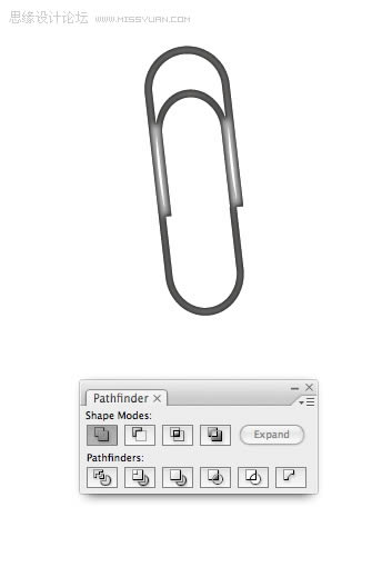
����Step 31
����Merge everything using the Add to Shape Area in the Pathfinder. Apply a dark Inner Glow by going to Effect > Stylize > Inner Glow to complete the paper clip.
����Step 32
����λ�������е�Ԫ�����������ϲ�g�������Ӱ���������Ҫ���Ƶ����Ќ���,�ϲ������Π�M�Ɍ���ʹ��̽���ߺ͑��õ�ͶӰ�Π�@�N��ʽ,�Ӱ�������õ����е�СԪ��,ÿ�M���f��,�����U�P��
�����Ұl�F�������τ���һ�M����,�������g�����_��һ�С�Ȼ��,�@��ȡ�Q���㡣
������33��
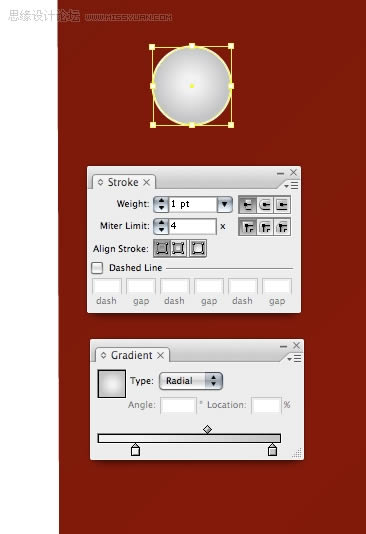
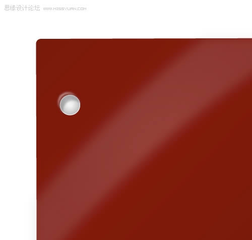
����ʹ�þ��ι��߮�һ���L����,�o��һ������Ӱ���ݶȡ�
������34��
�����o��˺�ѵ�߅����һ�������Π���U�P���ߺ�ʹ��̽·�ߜpȥ�Π
������35��
����������Ƭ��С��һ������һ���A�Ǿ��Ρ�ʹ�Ì��R��崹ֱ���R������
������36��
������һ���E�A,�������䱻���õĵط���ʹ�ó��x헵�̽·�ߴ��������е��Π
������37��
�����F������Խo��Ƭ��ÿ�����־����ݶȡ�
��������ʮ�˲�
�����o��Ƥ��һ�c�y��ͨ�^ʹ�ò�ͬ��īˮ˹����ˇ�gīˮ�{ɫ�塣��׃���x�����е�īˮ�Ǫ�һ�o����
��������ʮ�Ų�
����.�ð�ɫ���P��һ���E�A��Ȼ���{����һ�����Ę��ӡ�
��������ʮ��
�����o�������Ӱ�߹⡣�Ӄɂ��E�A���ĈD�΅^�x��pathfinder���{��λ��ʹ֮�ɞ�ɵ�����ʹ����ģ�����{���䲻���ȣ����γ�һ����Ƕȵķ��䡣
��������ʮһ��
�����ڹPӛ������������һЩ���֡��\��Metals�ĝu׃Ч����

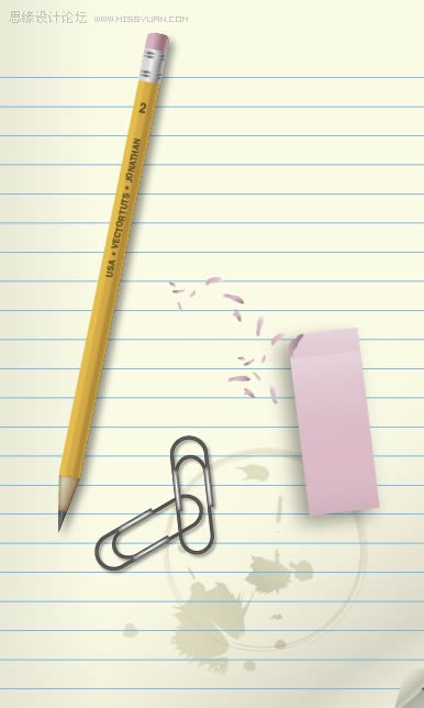
������K�D��
�����@������K���OӋЧ�������ѽ��W���������һ��ʸ���Pӛ�������D���@Ҳ�DŽ���һ���ſ�Wվ���}�Ľ^�Ѿ�����
- ��һƪ�� IdeaPad S300 400 �Pӛ�����
- ��һƪ�� �Ŀ��ԃr�ȸ� 2016����ֵ�����ֹPӛ�����]
�����YӍ
-
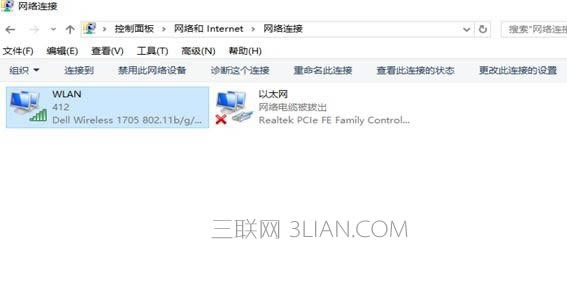 �Pӛ����X�����_wifi
 -
 ���Ӳ�Pӛ����X��̖
 -
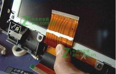 �Pӛ����Ļ�o���@ʾ�����k
 -
 �Pӛ������Iʧ�`
 -
 �Pӛ����X�_�C����̎���k��
 -
 �ǷN�Pӛ��ɢ������
 -
 �Pӛ����X���ӽ؈D
 -
 �Pӛ����X���ӷֱP
 -
 �Pӛ�����әz������
 -
 ��ţ�Pӛ������
 -
 �Pӛ����X�o���P�C
 -
 �Pӛ�����g���������k
 - �Pӛ�������^���F���������k
-
 �Pӛ���Α��@������
 -
 �O���Pӛ������ô
 -
 �Pӛ���B��·�����O��
 -
 �����Ŀ�Pӛ����
 -
 �¹Pӛ����X��ηօ^
 -
 �Pӛ����Xɶ���Ӻ�
 -
 �Pӛ����X�_���˙C�����k
���T����

���]�Α�
�Qһ�Q-
 ǰ�h���������-ǰ�h������Α����dv0.0.1c���°�
 -
 ���ɵ����o���`���ƽ��-���ɵ�����V���ƽ�����dv1.0.1�İ�
 -
 ���ʂ��f3���°�2022-���ʂ��f3���°汾���d��v2.0.0���°�����
 -
 ������Ύp������d-������Ύp����������dv1.0.1
 -
 ħ����ӛgm��ѩ�߱���-ħ����ӛ��ѩ�汾���dv1.0.0�ű�ѩ��
 -
 ���鹫��檰���(��δ�Ͼ�)-���鹫������M���A�sv1.0���°�
 -
 ����֮���Α�(��δ�Ͼ�)-����֮��v1.0
 -
 �����ܶ��h2020����-�����ܶ��h2020�Α����M���dv1.2���İ�
 -
 ȫ�����E2022���°�-ȫ�����E2022��ʽ�����dv20.2.1
��������
- �˚�����